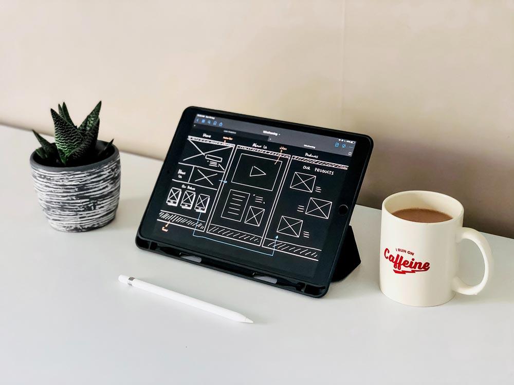
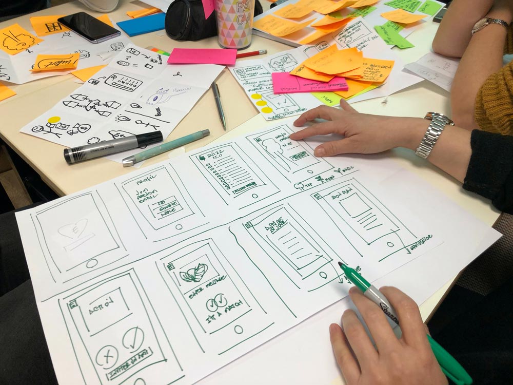
Your business website needs work. You’ve put all the relevant information out there for your customers, but your bounce rate is high, and you’re not getting the engagement you want. You need a way to draw people in — and get them to commit to taking the next step.
How can you use modern web design techniques to capture your customers?
Here, we have compiled six aspects vital to modern web design. Trends come and go, but with today’s focus on improving engagement and conversion, modern web design embraces techniques that have proved valuable over the years.
Balance
Finding the balance is an essential consideration for any piece of design, whether it’s for a website or anything else. Balance puts the viewer at ease, giving them a rounded, complete experience.
How does that apply to web design?
In the past, the occasional trend was to focus on visuals and neglect text content entirely. At the same time, when web design was in its infancy, there was far too much focus on text content and little ability to design high-quality visuals. Now, though, is the perfect time to bring the two together and achieve a balance in the amount of text vs. visual content, keeping in mind that we do, on the whole, tend to be drawn more to visual content.
Finding the balance in your web design means creating a whole, complete, harmonious layout using a variety of content types.
Optimized Visuals

Along with the balance mentioned earlier, the visuals you choose should reflect the modern approach to web design that you are using. For instance, make sure that each visual is high quality, unique, and sets the right tone.
You can also use alt text and descriptions to make good use of SEO keywords, a big concern for most web admins.
In addition to those aspects, consider including basic information in visual designs for your brand. For instance, to make sure that your site is easy to identify, include your brand logo in the left-hand corner of each page, keeping in mind company branding aesthetics. Learn how to go about it with this guide for using a logo creator for your branding.
Minimalism
Minimalism and modernism may seem similar since modern web design promotes a minimalist approach, but they’re two different aspects that work well together.
Minimalism has been on the upswing for a few years now, and 2022 sees it continuing to rise. Minimalism helps capture and retain customers because it reduces the chances of distraction and quickly leads the customer through the buyer’s journey.
Cutting down on unnecessary information, keeping visual stimulation to a minimum, and creating an impact-focused site help foster your customers’ investment and engagement.
On top of that, simplicity is a very appealing aesthetic, and it’s much easier to make it work for you and your customer than a cluttered site space would be, despite past trends.
Simple Navigation

An essential part of the overall user experience, navigation has also seen some crazy trends in the past. Whether it’s hidden navigation, unexpected elements that obscure the function, or a lack of functional navigation altogether, there have been a lot of different ways to approach what seems, on the surface, to be a pretty simple, straightforward web design necessity.
In keeping with the on-trend simple approach of minimalism, though, simple, straightforward navigation is also seeing a modern rebirth.
Along with that simple approach, modern web design promotes going the extra mile to help with UX, which can mean an entire sidebar dedicated to navigation and “navigation assist.” Elements in this sidebar can include tag clouds and suggested searches, making the already simple navigation even more accessible and rewarding to use.
Unique Calls To Action
Calls to action, or CTAs, are classic elements of well-designed web content. Nobody wants the customer-site relationship to end with a simple visit, whether generating a lead or making a purchase. After all, you want your visitor to be inspired to do something once they’ve checked out your site.
However, the CTA trends of yesterday are being augmented in modern web design by adding more unique variations. Typically, CTA language tends to be urgent, “Act now!” “Call now for your reward!” “Join now!” And while that language has its place, modern content also uses the softball approach.
Consider including CTAs that more clearly shows the benefit of taking action rather than pushing for the action itself.
Incorporating modern communication trends into your modern web design is also good. For instance, customers are much more likely to initiate contact with a brand via text or internet-based chat apps like WhatsApp rather than an old-fashioned phone call. Including these options in your CTAs can bring a modern approach that works.
Adaptive Or Responsive Design
More and more internet users rely on smartphones and tablets to visit sites, research, and make purchases. So creating an adaptive site that is optimized for use on any device is a vital part of truly “modern” design.
This aspect is key to capturing customers. Suppose your potential customer visits your site only to discover that the load time is longer or the site doesn’t load properly because she is viewing it on her smartphone. In that case, she’s much more likely to back out without any real engagement — and possibly not return.
Ensure that your site is responsively designed for the modern approach that encourages investment and engagement.
Wrapping Up
For today’s small businesses and startups, it’s compulsory to have a website to create an online presence and to have one designed that is modern and functional. Considering that current web users frequently visit all types of websites every day, making sure your website stands out is challenging. However, web design appeal is not only a criterion; you need to make your website work for you - draw in visitors, delight them with user experience, and convert them into customers.
The opinions expressed here by Guest Contributors are their own, not those of Rise Marketing.