When you hear the term “digital product,” one of the things you may not associate with it is logo design, but a logo is absolutely a digital product, too. The term can refer to a diverse list of impalpable, digital goods like a logo, a website, a mobile app, web radio, an e-book, a typeface, an infographic, streaming media, a photograph, graphics and even an online ad.
In this blog post, we’ll focus on taking a logo from ideation to completion.
In terms of design, there’s hardly anything more important that you can do for your brand than to get your logo right. A visual extension of your brand, your logo uses minimal symbols, colors and/or letters and words to communicate your business’ values to your customers and those who are just getting to know you. Take the time to develop this digital product, and it’s going to help you tremendously in the long run.
Whether you’re a business owner looking to establish yourself with your first logo or a graphic designer wanting to give your client exactly the insignia they’re looking for, here’s what to do.
Know Your Target Audience
Throwing yourself into designing this digital product willy-nilly will lead to bad results. You can’t expect to match a logo to your brand without it being appropriate to your target audience or values.

For example, if you’re a law firm, you likely wouldn’t go with bright and vibrant colors because they communicate fun and carefree feelings. Those colors would work with a travel or resort company, but if you’re a law firm, you’re likely going to choose something more serious, like neutral colors and earth tones, for a more no-nonsense, professional impression.
You should know who your target audience is: Are they coming to your brand to get their problem solved, or are they coming to you because they’re looking for something more light-hearted, like entertainment? Understanding crucial differences like this in your customers will inform how you design your logo.
Get a Lot of Inspiration
Once you understand what feeling and message your logo should communicate to your target audience, it’s time to research what other brands in your market are using for their logos. You don’t want to copy them, but you do want to understand what’s popular and what’s not in your industry.
Let’s go to social-media companies like Facebook as an example.
The logos of the three, big, social-media companies (Facebook, LinkedIn and Twitter) have many similarities like:
- Minimalism
- Simple and neutral colors
- Combination marks (using both words and/or letters and pictures)
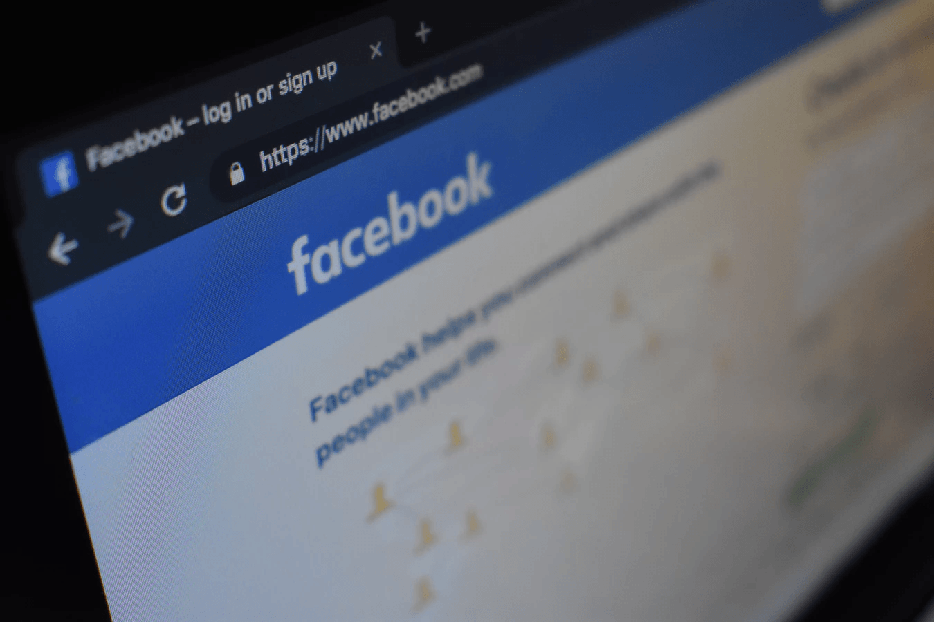
So, if you’ve somehow been able to raise a lot of angel-investor money and are about to start your own social-media company to compete with the established players, you wouldn’t want to stray too far from these characteristics of logos in your industry.
Once you know what others in your space are doing, you need to find further inspiration from sites that showcase various logo treatments and other creative designs from designers all over the globe, to give you additional ideas and get your brainstorming started in earnest. Some of the best sites include:
As you move through your visual research, be sure to keep a file of the logo designs you think are great examples for your digital product. Start up a dedicated Evernote notebook or Google Docs folder for this information, and start picking apart what common traits you see in the logos you admire and therefore want to take for your own design. Maybe it’s a specific shape, color or contrasting element that grabs your eye.
Start Sketching Your Own Designs
Okay, now you’ve done market research in your space and seen a multitude of logo designs on the aforementioned sites. It’s time to start sketching your digital product.
You don’t need to be anything close to a professional artist to do this exercise: It’s meant to help you take your concepts out of your head and put them on something tangible, so you can see whether or not they actually look good or too cluttered from an aesthetic point of view. Sometimes, what you’re wed to in your mind…can look quite a bit differently when it’s on paper!
As you sketch, give yourself the creative freedom to experiment, going with the concepts you have in mind and letting them further evolve. These sketches will be the early treatment of your logo.
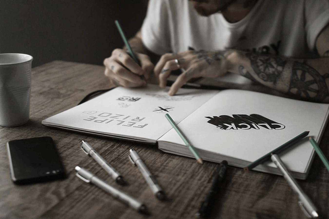
When sketching, keep these design principles in mind:
- Don’t Use Too Many Colors – Use no more than three, and have a solid understanding of which colors play well together and which don’t. To help you, have a look at color interactions on the color wheel.
- Use Simple Shapes (With One Exception) – In general, use simple shapes, so that your digital product won’t end up looking cluttered. Now, having said that, avoid generic symbols that fail to make your brand stand out, such as a star or a globe. Just think of how many other logos on the planet already incorporate these ultra-common shapes!
- Be Selective in Choosing Fonts – Understand that different fonts signify different things. For instance, sans serifs are modern, clean and popular. Many of today’s big brands (Google, Facebook, Yahoo!) use these types of fonts. On the other hand, serifs (fonts with those little feet or finishing projections) are more classic, symbolizing elegance and history, which is why more old-school brands (Burberry and Tiffany & Co.) use them. Finally, there’s script fonts, which is basically handwritten font. Use them if you want to convey emotion and flair (think of Coke’s and Instagram’s logos).
At this point, it’s also vital to get some feedback about your sketches, so you’re not completely in your own world as to what looks good and what doesn’t. Getting feedback from friends, family and co-workers is fine, but, ideally, you should be getting feedback from your target audience in some way, shape or form. A great choice to get this feedback is SurveyMonkey Audience, where you can get feedback from around the world.
If you have access to buyer personas for your brand, try to get feedback from people you know who match these profiles. Depending on the size and budget of your business or the business for which you’re creating this digital product, you may also be able to hold an actual focus group consisting of people from the brand’s buyer personas, for direct feedback from the right source about your logo sketches.
Based on this feedback and further exploration, feel free to refine your sketches as you deem necessary.
Digitize Your Digital Product
Once you’ve completed all the preceding steps, you’re in good shape to go to the last part of the process: Turning your logo into an actual digital product that you can use across a variety of brand touchpoints, from your website to print to even billboards.
Depending on whether you’re a business designing your logo yourself or a graphic designer creating a logo for a client, your remaining course of action is going to be different.
If you’re a business, you can use a number of free or low-cost, logo-creation tools on the web to bring your design across the finish line:
Now, it has to be said that, with these logo tools, you’re going to be using templates that each service has in its library, so the most you could do is try to select a template from their vast libraries that comes close to matching the sketch you made. However, you do have a degree of customizability with each of these templates (colors, shapes, typography).

The other option for businesses is to hire a graphic designer so you can be sure to get 100% customizability on your digital product. Graphic designers are easy to find on the web these days, ranging from ultra-low-cost options on Fiverr to custom-made, logo-design solutions that graphic-design agencies like Rise offer.
Of course, if you’re a graphic designer creating a logo for a client, the only thing left for you to do is to turn your sketches into a vector. A vector is essentially a math-based relationship in between two points on a figure. Software like Adobe Illustrator can seamlessly stretch, bend and reshape these points larger or smaller than the original, thereby ensuring that your digital product will be high-quality in any size, whether on a business card or a giant billboard.
At last, your logo design is complete, as it’s scalable and therefore usable for all sorts of purposes.
The Perfect Digital Product
Designing your logo for your business or client isn’t going to be a perfect science. Since you’re dealing with feelings above all, the impression your logo gives off is going to be subjective in many ways.
That said, following the procedure outlined above is going to drastically heighten the chances of your logo being well-received by your target audience, clients and people in general who understand and appreciate the aesthetics of a great design.