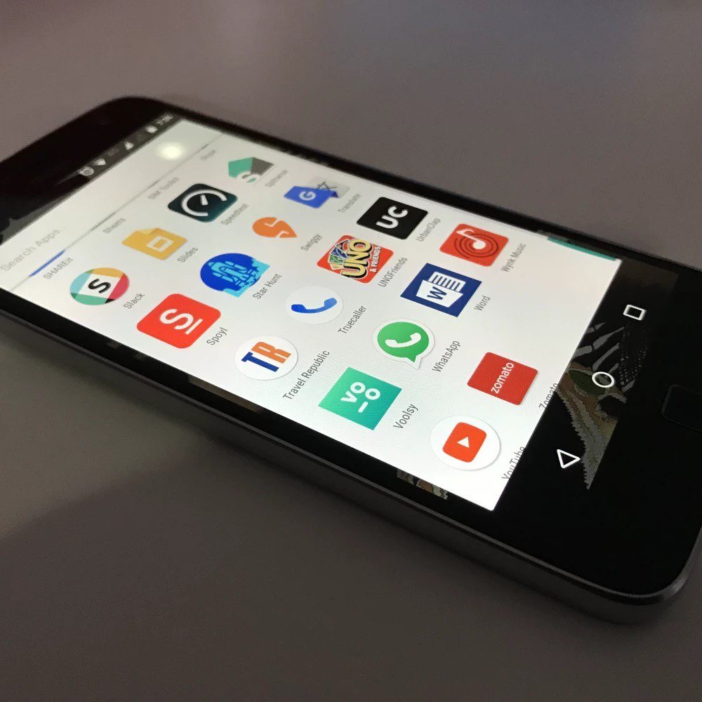
How to design for great mobile UX needs to be at the forefront of everything your business does on the web. Unless you design with mobile in mind first and foremost, your business is not going to be as successful as it could and should be. The reason is straightforward: Mobile has long overtaken desktop as the number one method of people accessing the Internet. In other words, fail to design for mobile…fail to get as many site visitors, leads and customers as you could.
Let’s look at the stats.
According to Smart Insights, we’re past the point where the number of mobile users has surpassed the number of desktop users. This tipping point happened in 2014. Since then, the number of global mobile users has only continued to aggressively climb while the number of desktop users has increased less rapidly.
The bottom line: More leads, visitors and customers will land on your website on their mobile phones, not on their desktops.
If you want to maximize your conversions, then your site must be optimized for mobile first. Today, great mobile UX is also successful mobile marketing.
Let’s take a look.
How to Design for Great Mobile UX: What the Stats Say
Any time you want to establish a solid use case for justifying spending in your business, say, for example, for mobile-first design, just look at the stats on how and where people are buying these days. Go where the evidence leads you.
Global tech company Criteo, which specializes in commerce marketing, came out with a press release that revealed that mobile sales in the U.S. alone now account for 52% of all ecommerce transactions. Clearly, if you want to sell effectively and successfully…you need a very efficient mobile presence with a great UX.

Here’s another very interesting stat that actually reveals more than what it seems to, on first glance.
According to Adobe’s Mobile Retail Report, conversions are 2.8 times higher on desktop than on mobile. If you think this means that it’s not important to optimize for mobile, think again. This is actually all the more reason to commit to a mobile-first strategy, especially since mobile still accounts for more traffic than desktop.
The reason that conversions are higher on desktop is likely due to the fact that mobile experiences are not as optimized as they should be—not because people don’t prefer to shop and convert on mobile, where it’s more convenient for them in the first place!
Imagine a scenario where your mobile site is perfectly optimized, receiving more traffic than your desktop site, and seeing more conversions than desktop, all because you implemented great mobile UX.
It’s within your reach. Here’s what to do.
Design for Thumbs…but Not Primarily for Thumbs
Mobile usability should be based on all of the various ways in which people are known to interact with their smartphones. How to design for great mobile UX is as much common sense as it is evidence-based.
It’s tempting to assume that, if I’m using my smartphone to navigate and shop on a mobile site, it’s more convenient for me to do so by just holding the phone in one hand and using the thumb on the same hand to accomplish my user goals. It’s equally tempting to assume that it would be less convenient for me to use both hands (phone in one hand and using the index finger of the other hand to accomplish my user goals).
However, this conventional wisdom is actually wrong because it presupposes that people only or mainly use one hand to operate their phones.
Research shows that there are actually six, distinct ways in which people hold and interact with their phones. Any mobile site that fails to design for all six ways is going to fail and experience lower conversion rates because the UX will suffer.

The six ways are:
- Cradled (one hand supporting the phone while the other hand’s thumb taps)
- Hold and touch (one hand supporting the phone while the other hand’s index finger taps)
- Two hands for landscape orientation (think of how you would hold a handheld gaming device like the Nintendo 2DS XL)
- One hand – first order (one hand holding the phone while the thumb on the same hand taps)
- One hand – second order (one hand holding the phone while the thumb on the same hand taps, but from a higher starting position)
- Two hands for portrait orientation (think of how you would hold a handheld gaming device, this time, like the old Nintendo Gameboy)
Now, and this is where things get really relevant, here are the different use cases for the various ways you can hold a phone:
- Tapping on links – Most hold and tap or cradle
- Checking boxes – Most cradle or hold and tap
- Typing – Most use two fingers or thumbs simultaneously or hold and tap
- Short scrolling – Most hold and tap or cradle
- Longer scrolling – Most cradle or hold and tap
Bottom line: Design your mobile site to accommodate the range of these different ways people hold their phones.
Bigger Buttons Are Better
If you’re contemplating how to design for great mobile UX, one of the most vital aspects to home in on is button size. As with all things mobile, your screen size is much smaller than tablet or desktop, thereby compromising your mobile site’s usability if the buttons are too small. Buttons of inadequate size lead to UX errors like:
- Difficulty to properly tap the buttons
- Problems with seeing the buttons in the first place
- Having a hard time understanding that a button can be tapped or otherwise interacted with
Err on the side of bigger is better.
Bigger buttons ensure a smoother UX for your shoppers, customers, visitors, etc.

This begs the question, how big, exactly?
According to Google’s own Material Design Touch Target Size guidelines, mobile buttons ought to reach a touchscreen size of between 7 and 10 millimeters. In other words, buttons should possess a physical size of approximately 1 centimeter, regardless of what screen they appear on. This ensures a great balance between:
- Information density
- “Targetability” of the user interface elements
When your users can more easily see buttons, understand their spatial relationship to other on-screen elements, and tap them to successfully complete page goals, then you give them amazing UX.
Prioritize the Most Important Content
The answer to the question, How to design for great mobile UX? sometimes lies in what you subtract instead of add. In the case of on-screen content, this rule applies 100%.
The blessing of smartphones is their small and portable size, in spite of the recent trend to increase mobile screen size. This convenience has a downside, which is that users are subjected to a greater interaction cost. This is the physical and mental effort they have to expend to achieve their mobile-site goals.
For example, if you navigate a news site on your desktop, you’ll likely be able to see on the homepage the sports scores and the weather forecast in sidebars above the fold, so you don’t have to bother with scrolling down. On mobile, though, this same content would likely necessitate some serious scrolling to reach because space comes at a premium on mobile.
Therefore, the only solution is to prioritize the most vital content above the fold on mobile. In other words, think hard about what content to show your users and visitors above the fold on your mobile pages. After all, for each element of content that you include above the fold, another element has to be pushed down and even sacrificed below the fold.
One approach to help you maximize the mobile content above the fold is to minimize the so-called chrome. We’re not talking about Google’s browser in this case. Chrome is the collection of visual design elements that help users interact with or give extra information about an interface’s content, but is not part of the content. Chrome comes from the mobile phone’s operating system.

An example of chrome would be all the pictures associated with people’s accounts when you’re viewing emails in your Gmail app’s inbox. In this example, these pictures help you additionally identify your senders, but they’re not absolutely essential in identifying them (the From line in the email itself would be enough).
By cutting down on these chrome elements, you greatly conserve mobile screen space and therefore stand a better chance of putting the most vital information above the small fold area.
Focus on the End User
The secret to how to design for great mobile UX always comes down to the end user. Keep that in mind when designing your mobile sites, and you’ll create a site that’s user-friendly. It’s that straightforward.
To get there, make sure you’re designing based on real data and not assumptions. A great place to start is with how your users hold their phones in the first place. If you’re designing for a way many people aren’t even holding their phones, then all bets are off.
It’s key to also remember that, due to the small mobile screens, content has to be easily and quickly seen, so make elements bigger, and make sure the most important content lives above the fold.