In today’s digital age, first impressions can greatly affect your business’s success or failure. Even the smallest fault or bad customer experience can deter the customer, and they will be on to the next website in no time. That’s all it takes to damage your conversion rate.
This is why the above the fold design on your website is so important—it’s the first impression your customer has of your brand, and you have eight seconds to capture their attention and draw them in to reading more about your product or service offering.
What Is Above the Fold Design?
Above the fold is a term used in digital and print media. It’s interesting to know where it originated from and how it applies to website UX design.
Newspapers are printed on double-sided, large-format pages that are folded in half. The term “above the fold” traditionally referred to the top half of a newspaper’s front page. Similarly, “below the fold” referred to the bottom half of the newspaper.

When placed on a newsstand, the top-half, or above the fold, of the newspaper is the part that is easy to spot. This is where the most important headlines are printed.
In UX design, above the fold refers to a similar area on a website. The upper part of a website that is visible before scrolling down is called the above the fold section.
For this reason, above the fold is the most important part of any website. It’s the most impactful area on a website that affects a customer’s decision to stay on, or leave a page.
How Can You Improve Above the Fold Design?
Now that you know what above the fold means and how crucial it is, let’s learn how you can improve it. There are tons of website themes for Wordpress and other platforms that are impeccable and set you apart, but having a custom design aligned with your brand standards is the most impactful and effective.
Here we discuss 5 practical ways to design an eye-catching above the fold section that keeps your audience interested and engaged:
- Consistency.
If you want to enhance your customer’s session times, stay consistent across all of your digital marketing efforts. Suppose that you are running a pay-per-click (PPC) campaign. You have successfully encouraged people to click on your PPC ad. When they click through, however, the page that they land on looks nothing like the ad and they get confused. Is this another company? Did I just get spammed? This is a big turn-off for your visitors and negatively affects your conversion rate (CR).
- Unique Selling Proposition (USP).
When visitors land on your website, they should understand quickly what your organization is offering. Make it clear to your website visitors what your USP is and how you can uniquely solve their problems. Visitors will abandon your website without a second thought if you don’t make this clear right away.
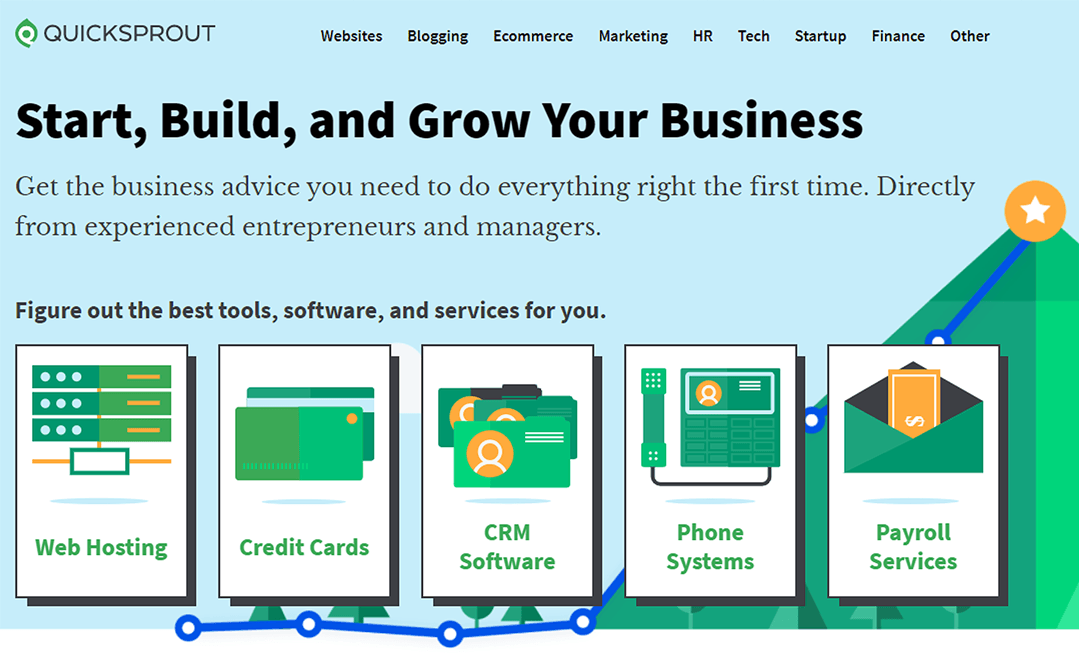
Create a headline that explains what your company does. Remember to keep it short and explain your solutions concisely. For example, when a visitor lands on the QuickSprout website it’s clear and easy to understand what they do. Also, visitors can select any of the services to explore them in further detail.
Nudge visitors to discover more about how your product can benefit them. Drive them toward a contact web form or phone number if they are interested in more information or buying what you’re selling.
- Call To Action (CTA).
If you want to increase your CR, be aware that users want information quickly. It’s critical to come up with creative ways to get your information over to them.
So, provide answers to your potential customer base as soon as they land on your website or notice online ads. You want a clear and compelling CTA, preferably as soon as the page loads, without the need to scroll.
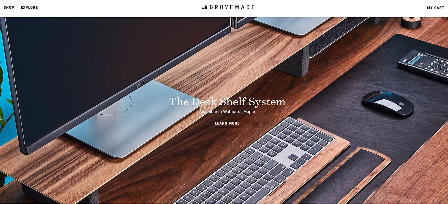
For example, Grovemade has made a very simple yet effective above the fold. When you land on their page you see a noticeable and informative headline expressing the USP. The next eye-catching element is the “learn more” CTA.
Make your CTA button stand out by using contrasting colors and visual effects. If you want your visitors to click on that button, you need to visually make the button stand out so their eye is drawn to it easily.
Remember that while making a CTA, your message should have a clear font and an appealing tone that is defined as part of your brand voice.
- Navigation.
It’s vital to use clear, simplified navigation methods on your website so that your visitors flow nicely through the pages and find the information they need to explore further.
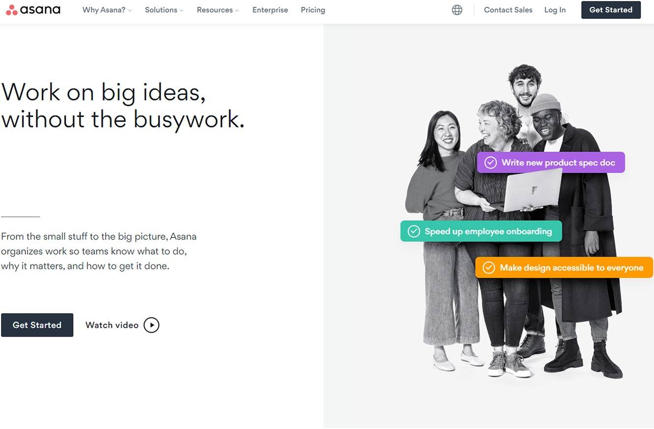
Asana is a good example of easy navigation. The menu bar is placed where it is expected and your eyes naturally look for navigating options. You can scroll down for more information, which is the natural action that most visitors do while browsing a website:
Simple and familiar navigation methods are more user-friendly and effective because that’s what customers are used to with other websites. The point here is instead of out-of-the-box ideas for navigation flow, stick to what users expect when interacting with your website.
- Testing.
A perfect above-the-fold design requires practice and optimization to reach the best result. Ecommerce has become very competitive and a company’s performance is directly related to the quality of its website. To determine the optimal version of your site, you must continue to A/B test, modify and test again. Look at the data and use it to provide insights into your web content and design.
There are a variety of KPIs and metrics available to assist you in evaluating the performance of your website. Google Analytics is one of the tools providing data on metrics such as bounce rate, CR, page views, etc.
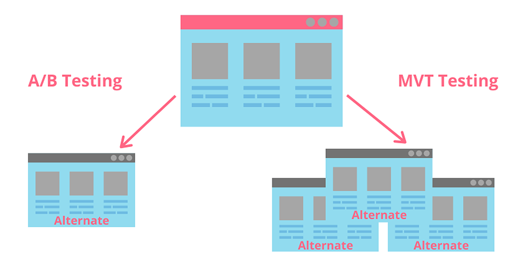
It’s undeniable that analyzing a large amount of data is difficult and time-consuming. So, that’s where A/B testing comes to help you. This type of testing allows you to evaluate a hypothesis and redesign your website when necessary.
Multivariate testing or MVT is another method for evaluating above-the-fold design. However, it allows you to check more than one combination of components at once.
Both of these testing methods are useful based on the testing requirements.
Conclusion
Designing an eye-catching above-the-fold experience for your website can make or break your business. Take it seriously and hire a web development agency with a proven track record that produces results for their clients.
The opinions expressed here by Guest Contributors are their own, not those of Rise Marketing.