Are you a marketer looking to hack your conversion rates? Do you find yourself copying your competitors? Do you want the best growth hacking techniques to improve your conversion rates?
Marketing UX, much like any growth hacking technique, has few hacks of its own. And guess what? It won’t cost you a dime.
#1 Visual Hierarchy
It’s about creating a hierarchy of information based on importance—prioritizing the most crucial piece of information to the least based on what is viewed first, second, third and so on.

Why does it matter for marketers?
Let’s consider a landing page. If your prospects don’t notice important information from the get-go, that information becomes unusable. And if people don’t see your persuasive words, they won’t pursue the goal you set. Now, if your landing page is unpersuasive and unusable, it means your landing page is not going to achieve much.
Behavioral design is about placing information in places your prospects look. Visual hierarchy and layout are fundamental tools Cartographic designers use to organize their maps. This is the secret behind Google Maps’ success.
Marketers and designers need to collaborate in defining the visual flow. Ask yourself these questions:
- What information do I want my audience to gain access to?
- Where will my audience first look?
- Where will they look next?
- And where do they end up finally?
Importance of visual hierarchy
- It helps your audience notice elements they need to look at
- It guides your audience in finding the information they seek
- It helps guide your prospects towards conversion
- It aids in building a usable and useful page structure
#2 Whitespace
Whitespace is a tool all marketers need to be aware of. In layman’s terms, it’s the empty space between paragraphs, images, buttons, and headlines. Whitespace is ignored and undervalued. I often hear managers say, “There is too much space. Let’s bring in some graphics so the page looks more lively.”
“Whitespace is like air: it is necessary for design to breathe.”
— Wojciech Zieliński
Google is one of the best advocates for whitespace. They know people want a simple way to search for information. To make this appealing, they removed page clutter and focused on the primary action—the search bar.
Importance of whitespace
- It grabs attention and directs focus to elements that require it
- It improves readability: an oft-quoted study showed that whitespace improves comprehension by 20%
- It creates a feeling of sophistication and elegance
- It declutters the page and creates a balance within the site
- It can give relief to readers as well as impact their perception. For instance, in a page full of pictures and narrative content, it is necessary to give the brain and eyes a break (Thomas, 2015)
#3 Visual Cues
In the digital marketing context, visual cues are aids such as arrows, pointing fingers, or lines that direct your audience to an important element on web pages, ads, and other channels. Instead of making your audience browse the entire site, you give them visual indicators to critical pieces of information. That way, they know exactly where to look.
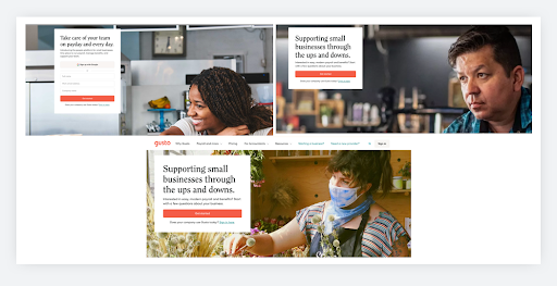
Gusto often incorporates eye gaze to focus their attention towards their CTAs and value proposition. Another key aspect of using people’s faces, it stirs emotion. In the case of Gusto, during the pandemic, they changed their image from a person who looks happy to someone who looks concerned (a major emotion for small business owners during the pandemic).

Importance of visual cues
- It grabs attention and brings focus to elements that require it
- It guides your prospects to take action
- It takes away focus from the superficial elements and maintains focus on actual content and action.
- It helps to solve the false bottom
In conclusion, just like marketing hacks, these UX hacks can come in handy for marketers looking to hack their conversion rates. Personalization and customer experience is climbing up the marketing hierarchy. With Google prioritizing user experience and usability, Marketing UX is no more an option. It is now a norm.
The opinions expressed here by Guest Contributors are their own, not those of Rise Marketing.